
Epsilis Web Design
T: 01279 295546
E: joseph@epsilis.co.uk
17 Easily Avoided Website Mistakes Made By Content Editors

If you are updating the content yourself on your website here is a list of common website mistakes to avoid that I come across regularly. Making any of these mistakes will hurt your website. It is extra work but it will make a big difference to how well your website works for you.
This article assumes you are using WordPress but most issues apply just as much to other site builders.
And it is not only the DIY’s that make these mistakes, I have seen plenty of professional websites that include these same basic errors. The problem is that the software doesn’t stop people from getting it wrong.
Table of Contents
Common website mistakes with images
1. Images are too large
Large images are probably the most common website mistake and they are often the reason a website is slow. Slow websites upset people and hurt your SEO rankings. Photos that come off a phone or camera can easily be 2 to 4 Mb. Photos used on websites ideally should be between 25 and 250 Kb. So they need to be optimised before they are uploaded. Images need to be:
- Reduced to the right size.
- Reduced to the right quality.
- Used in the right image format (jpg for photos, png for drawings …)
- Files need to be given descriptive names.
See How to optimise images for web use.
Pro Tip: Do not upload multiple versions of the same image. Only upload one and reuse it where you need it. A browser will cache images previously seen on other pages and not download the same one again. This speeds up other pages.
2. Using PNG instead of JPG for photos
If you use PNG for photos the image file size is likely to be much larger than if you use JPG. Perhaps 10 times larger! Photos optimise much more efficiently as JPGs than as PNGs.
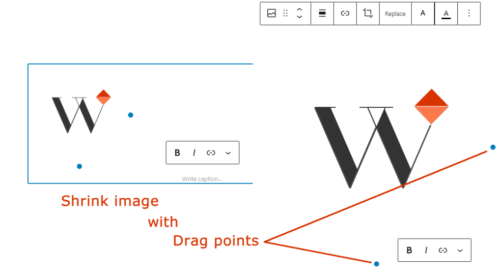
3. Using the drag points to resize images
Another common website mistake is to reduce the size (height and width) of an image using site editing features that allow you to drag a side or corner. This just means the image is bigger than it needs to be and is being resized by the browser after downloading it. This can also lead to the web page re-organising itself in front of you which is annoying.
4. No image alternative text tags
Images that are part of the web page content need alternative text descriptions. So that when the image cannot be seen it can still be understood. This is an Accessibility requirement and it affects SEO.
The alternative text needs to be very brief and accurate.

5. Hiding Keywords in Alternative Tags
Another common website mistake is using image alternative tags to hide keywords for SEO purposes. This is an abuse of the proper use of this tag and should be avoided.
See How to use alternative text tags and why.
Copy and paste problems particular to websites
6. Copy and paste messy text
If you simply copy and paste text you may get a lot of unwanted format code. This code can be font formatting, colours, links etc.

Sometimes it is very obvious when you see lots of rubbish you did not expect, or the result will not display as expected. Other times it is hidden in the background.
The standard WordPress block content editors do a good job of filtering out this unwanted garbage but not all content blocks work as well. So some garbage can still get through. Be careful when you copy from Word documents, emails (can be very bad), other websites, or even a different page of your website.
If you have problems you can ensure the text is pasted without formatting. Right-click and paste as plain text or similar depending on the browser you are using. Then you should have clean unformatted text ready to format as you wish.
7. Don’t copy and paste images
If you do this the image stays where it is and WordPress wraps code around it to embed it from its current location.
If that is another website you may not notice you are piggybacking onto that site but you have no control over it remaining available and it is slowing down your webpage.
If it is on your computer it may look fine to you but no one else is going to see it.
Images need to be uploaded to the WordPress Media Library (having optimised them first – see Images are too large).
8. Poorly written content
Most people do not write good copy the first time. They tend to use too many words and make sentences too long. Long sentences are more difficult to understand and long paragraphs are very off-putting. Whatever you write it will be easier to read if you keep it as simple as you can. And you will be helping your audience by using:
- Short words.
- Short sentences.
- Short paragraphs.
- Lots of sub-headings – helps people scan your content.
- Images to break up large amounts of text.
Don’t be lazy. Edit and re-edit your content until you are pleased with it. Then you have a better chance of being understood by your target audience.
See How to write appealing copy for your website and How to write great headlines.
Another common issue is “writing about you rather than writing for your audience“. Think about what your audience wants to know. What do they ask you about? Write for your audience using their language and not your jargon.
Common content presentation mistakes
9. Using more than one H1
Having more than one H1 is a common website mistake. People often want very large text sub-headings so they go for the largest heading available which is usually H1. The font size is a feature of the design template. But H1 also has a structural meaning relevant to accessibility and SEO.
A web page should have one and only one H1 (Heading 1). In WordPress, this is the page Title and will normally be added automatically.
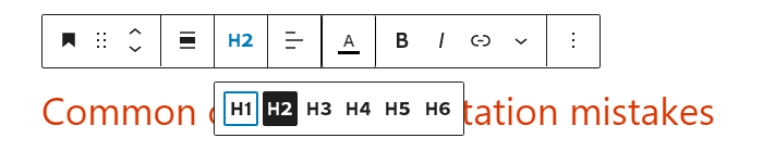
Do not use H1 within the content even though the editor will let you. Any sub-heading should be H2, H3, H4 … H6. They are hierarchical, H2’s are the main sub-headings on a page, H3’s are sub-headings within a H2, and so on.

If you want large text like this there are options to do this under typography for individual paragraphs.
Wholesale changes should be made through the theme settings.
10. Underlining text
Do not underline text for emphasis. While this may be a common technique in general writing it is wrong on web pages.
Links should be underlined. (If the Theme does not do this automatically it has been designed badly.) This is an accessibility requirement.
11. Click here
Links that just say “click here” or something similarly non-descript is only useful if you have read and understood other information around them.
Did you know:
- Blind or poorly sighted people can use speech browsers that read the text on the page out loud. One of the useful features of these browsers is the ability to skip between headings (H1, H2 …) or links. This is the equivalent of skim reading. It saves trawling through everything to find something of interest.
- Search Engines use the text in a link to help evaluate what comes at the other end of the link.
So the text in a link (the anchor text) should provide the context and briefly describe what comes next.
BTW: WordPress, for example, automatically adds links like Read More after an article (Post) taster. But this all works because there is a Title (that is linked), then a paragraph, then the Read More (that is linked).
“Read More” type links are following on from what you are reading. Whereas the bad “Click Here” links go off on a tangent to associated content. There is a difference.
13. Only thinking about the screen you are looking at
I occasionally have to tell people they cannot put things anywhere they wish on the screen (such as in the white space either side of the main content) or they can’t use a particular presentation layout.
The problem is – they are just looking at what they see on their screen. They are not thinking about the range of screen sizes (desktop, laptop, tablet, mobile) and shapes (landscape and portrait) now in use. And how websites rearrange themselves (responsive design) to work on different screen sizes which require content to flow naturally.

Many websites are now browsed more often from mobile phones than from any other device. So when you layout a page you have to think about how it is going to look on other devices.
Pro Tip: Think about mobile phone screens first then work up to the larger screens.
14. No call to action
Don’t leave your readers hanging – suggest to them what they should do next. This is a Call To Action (CTA).
Often at the end but not exclusively. They are almost an instruction designed to tell visitors how to take the next step and often use a sense of urgency around an offer.
To guide and engage the visitor, throughout the website. Simple CTA’s include:
- Click on a link to go to more information,
- fill out a form,
- join a newsletter,
- add a product to the shopping basket.
Other common website SEO problems
15. Ignoring SEO
Ignoring SEO is probably the most common website mistake I come across and it has been the case for the last 20 years.
If you have not thought about what your audience is searching for and their keywords. Then it is unlikely you are using the right keywords in your text. So you have little chance of troubling the search engine rankings.
The best content starts with thinking about what people want to know and then providing the answers.
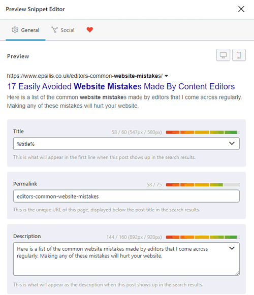
WordPress can be set up to automatically generate SEO TITLE and SEO DESCRIPTION. If your setup does this it’s a good start.
But it is much better if you craft these manually to provide the best summary of your content. And make sure you include some keywords
See How to optimise content for the search engines.
16. No internal linking
Linking is the whole basis of the world wide web. Writing new content and not linking it to other related content on your website is not helping your readers.
Linking is also the oil that powers SEO. Not having a network of links within your website content is going to hurt your SEO.
But don’t navigation bars do this? No, they are essential but they do not do the same job. Links within content join together related information across pages.
Pro Tip: When you add new content don’t forget to review your old content and add links to your new content where relevant.
17. Changing the page slug
If you change the slug of an existing web page it will fall out of the search engine rankings. I have seen people ruin their search rankings by tidying up their page addresses.

The SLUG is the last part of the page URL (page address). It is specific to that page.
This is interpreted as the deletion of a page by the search engines. And new pages take a long while to get established again.
Almost 95% of newly published pages don’t get to the Top10 within a year.
Ahrefs
If you have to change the slug because it is now clearly wrong then change it. But you also need to create a 301 redirect from the old page address to the new page address. This is an instruction to the search engine that your page has moved. If you are lucky, after a short while the new page will take over the search engine reputation gained by the old page.
I hope that all helps keep your website content healthy, effective and legal.
You may also be interested in:
If you need expert help with your website contact Joseph Tirelli today.
Epsilis Web Design,
WordPress Specialists with over 25 years of experience.
PS. If you want to ring the best time to get me is between midday and 4 pm Monday to Friday. If you prefer email I aim to respond the next working day.