
Epsilis Web Design
T: 01279 295546
E: joseph@epsilis.co.uk
Poster Images: How to add posters to websites correctly

So what do I mean by Poster Images?
Basically any image containing lots of text. Think about typical social media images, infographics, posters, wordclouds…
Table of Contents
For example, an image advertising an event
So an image where all the information required such as title, date, time, location, who will be there, the whole shebang, has been added into the poster image. Probably there will also be some graphics as well.
The key point is that this is a graphic containing quite a bit of text.
I can just upload this poster image can’t I?
Yes you can but you may be doing a pretty poor job as a result.
You might think it is a good idea to upload your Event Poster image to your website and your social media pages, as it is because it provides everything you need to know about your event.
But…
There is a fundamental problem = accessibility
Screen Readers Can’t “See” Images – If text is embedded in a poster image and there’s no accompanying real text on the webpage, screen readers won’t pick it up. That means visually impaired people using a screen reader, are not going to see your poster.
So the text also needs to be available as real text that can be read by screen readers otherwise these people are going to miss your message and all the important information you were trying to convey.
This is a basic accessibility requirement. If an image contains useful information, that information also needs to be available in an accessible format.
Incidentally, this applies to all websites, including all the social media platforms where this sort of graphic is rife without much thought given to any accompanying text to help all users appreciate the content.
But I can put text in the alt tag!
If the text is relatively short (under 125 characters) it can be added into the image alt tag on your website. More than 125 characters, then it is too long for the image alt tag as it will be truncated by most screen readers and therefore needs to be added to the web page as real text.
Size matters for readability
An image that looks great on a laptop might become unreadable on a smaller mobile screen. The more text crammed into a poster image, the harder it is to ensure visibility across devices.
It is only possible to put a small number of words on any image and it remain readable everywhere. Text may be legible on your desktop or laptop screen, but as the screen size gets smaller, so does the text and it gets to the point where it’s not readable. Small text will be a problem even for normal sighted users when presented on small screens.
I am no spring chicken, I am in no way visually impaired but my eye sight is nowhere near as good as it was. I struggle to read small text in everyday life. The worst is usually product labels. So it is not just visually impaired people who don’t like small text.
So when designing your poster image you need to consider how it is going to be used and include all your audience.
- If it is just for online use then it is best to limit the text content to as few words as you can.
- If it is going to also be used for printing then you might want to include all the details and do a different version for this purpose.
They are also terrible for SEO
SEO Struggles with Image Text – Search engines rely on real, readable text to understand webpage content. So anything you write within the image is likely to be missed by the search engines.
If key information is trapped inside an image, it won’t be indexed properly, making it harder for people to find it through search.
Purely decorative images
No need to worry about these. Only images that contain useful information need to provide that useful content in real text form as well.
Can you put text over an image the right way?
Yes you can on your website. The text can be real text in a layer sitting over a background image.
This can be done quite easily in WordPress.
One option is to use a Cover block.

This is a Cover Block
This text is in an overlay on top
of the background photo.
You have to be careful to ensure the text is always easily readable regardless of how the image and text move around depending on screen or window size so it can be tricky to get the balance right.
It works best when the image is quite simple and has a strong contrast with the text colour throughout. If you end up with text that is not very easy to read because of the image background, then you may still have an accessibility problem.
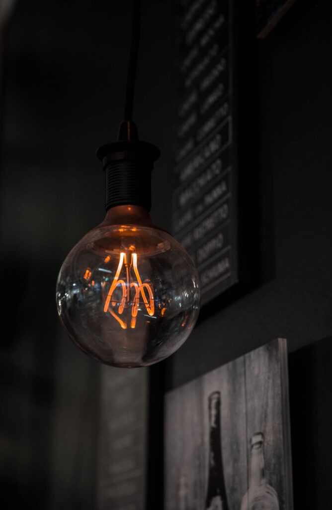
Alternatively, you could use a Media and Text block (like this one) that allows you to display an image and some text side by side.
This provides a nice layout without any issues associated with making text readable over an image and might be the better solution in many cases.
Summary: Common Poster Image Mistakes to Avoid
So stop and think before you just upload that poster graphic you have just spent hours creating in Canva or Photoshop.
The way information is presented can make a huge difference in how effectively it reaches all users.
Here are some common mistakes to watch out for:
- Relying Solely on Embedded Text
- Screen readers cannot read text inside images so always provide real text alongside the image.
- Ignoring Text Size and Readability
- Keep text bold, large and legible across all devices.
- Not Using Alt Text Properly
- Alt text is crucial for accessibility, but descriptions over 125 characters should be placed on the web page as real text.
- Compromising Contrast and Visibility
- Poor contrast between text and background can make information difficult to read for many users. Use high-contrast colours for clarity.
- Overloading the Image with Information
- Cramming too much text into an image. Keep poster images concise and provide additional details as real text.
Images containing text embedded within graphics, are bad for inclusivity and are invisible to search engines. To improve accessibility and SEO, useful information you want to convey should be added as real text on the webpage with the image.
You may also be interested in:
If you need expert help with your website contact Joseph Tirelli today.
Epsilis Web Design,
WordPress Specialists with over 25 years of experience.
PS. If you want to ring the best time to get me is between midday and 4 pm Monday to Friday. If you prefer email I aim to respond the next working day.